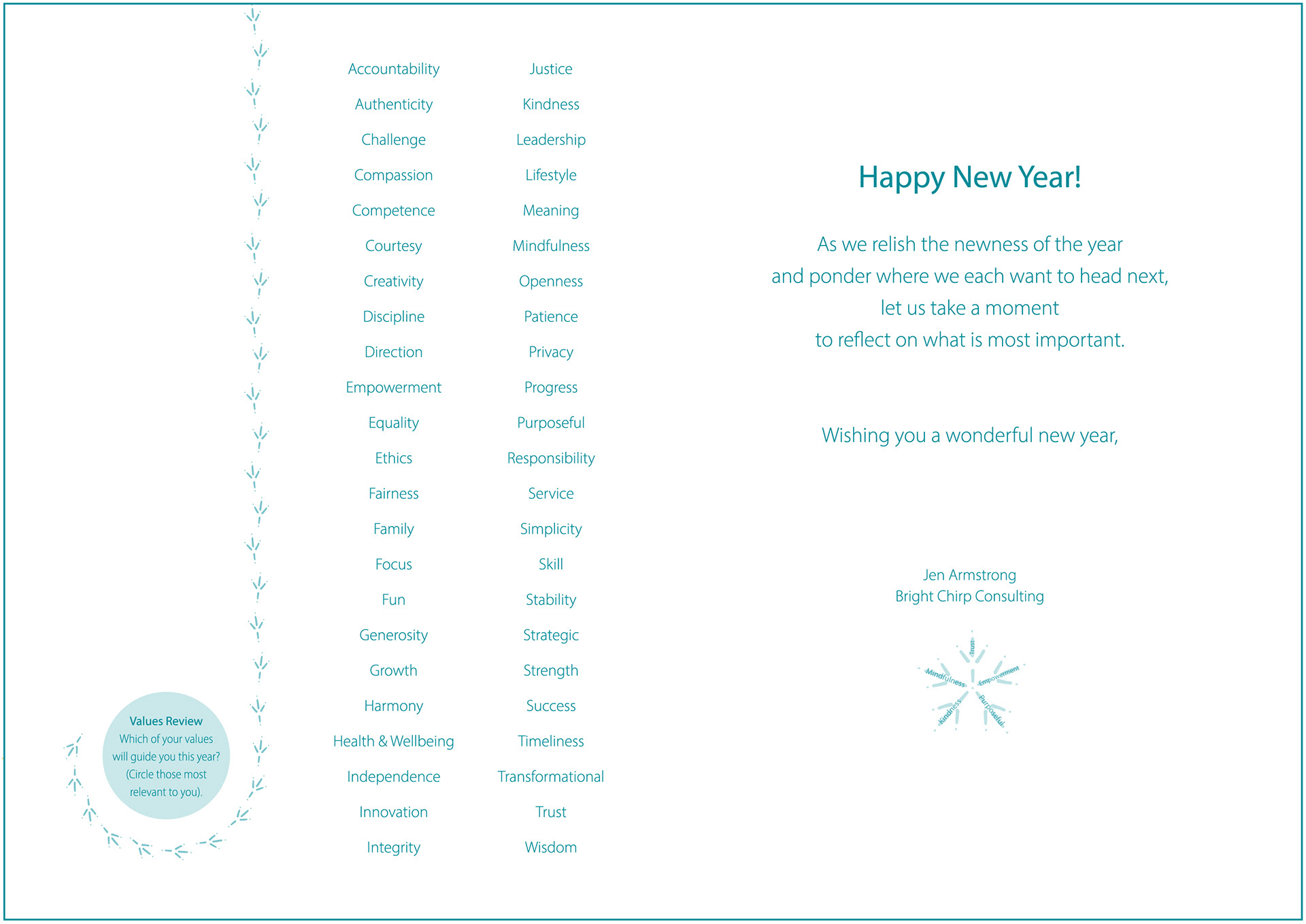
The design objective was to create a sense of movement as a way to animate a “chirp” and bring to life the consultant’s direct yet un-stuffy style. This was achieved by using crisp sans-serif font, a lively and welcoming color palette, and the secondary footprints graphic, which indicates direction and guidance while adding a touch of playfulness.


Note Cards - Front

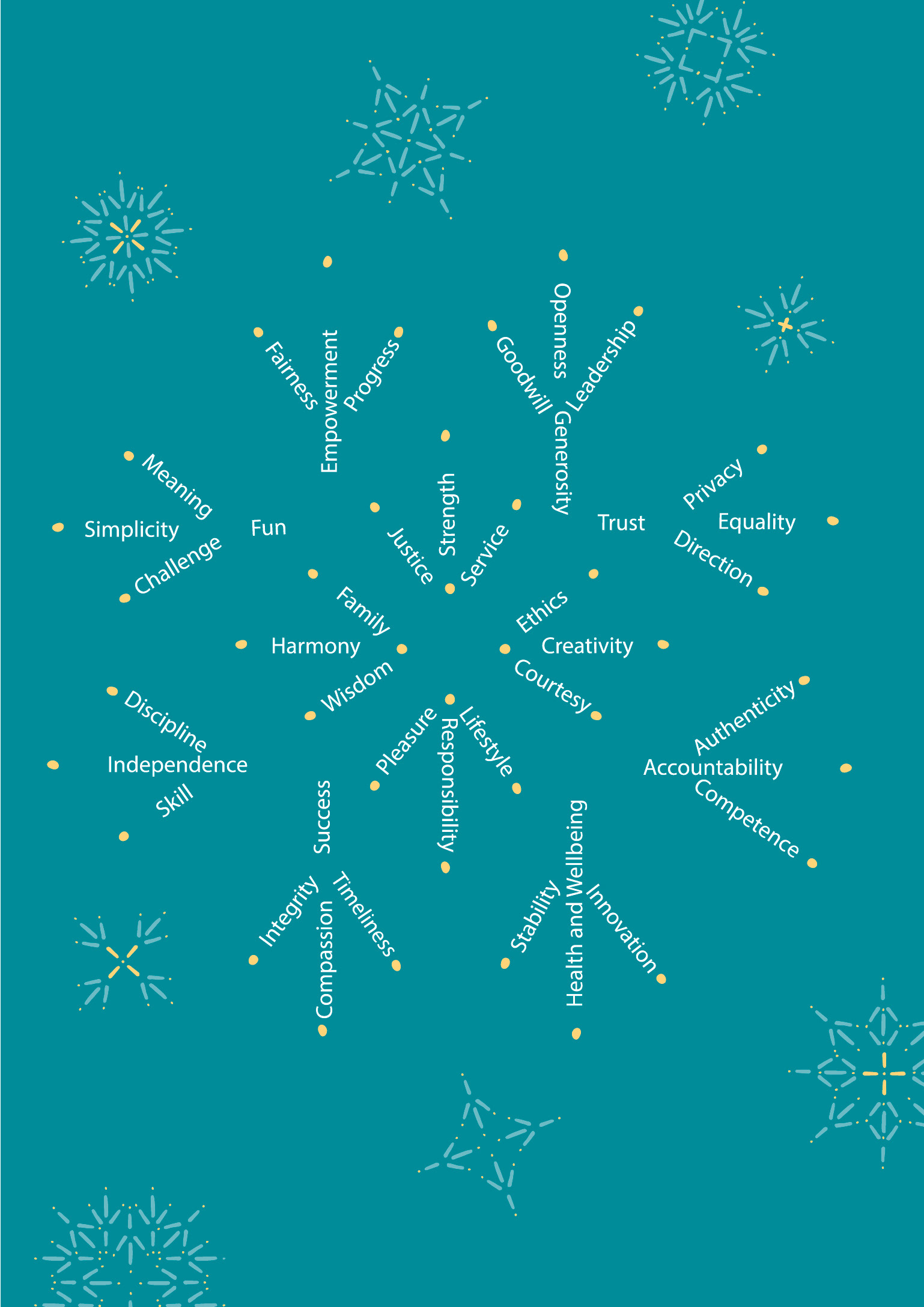
Note Cards - Back
Holiday card - front